A-1 Automatic Watch
A-1 Automatic Watch: Function x Design x Passion
A watch designed in Finland, with a soul of Japan.

A-1 is an automatic watch from a Finnish-Japanese design company AndoAndoAndo/AAA. Its founder is a Japanese designer Yu Ando.
Who is this watch for?
- People who love a good design
- People who like a watch with style and practicality
- People who want a comfortable watch that doesn't hurt the back of the hand
- People with relatively small wrists

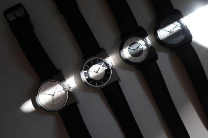
- Original: Other than the movement and its discs, every part of the watch is uniquely designed.
- Simple: No unnecessary decoration.
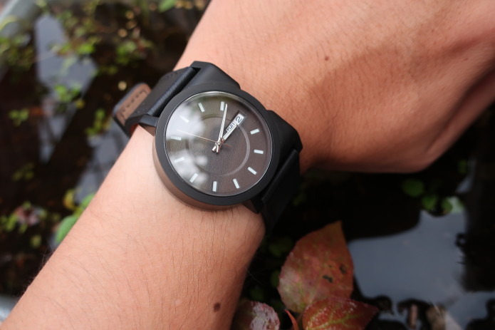
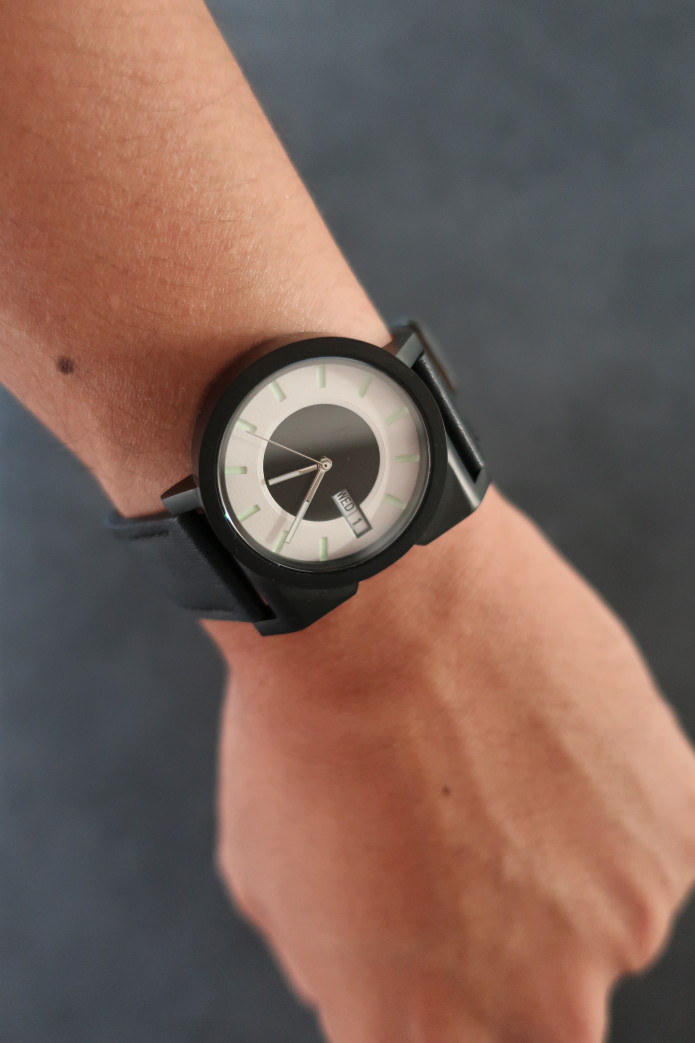
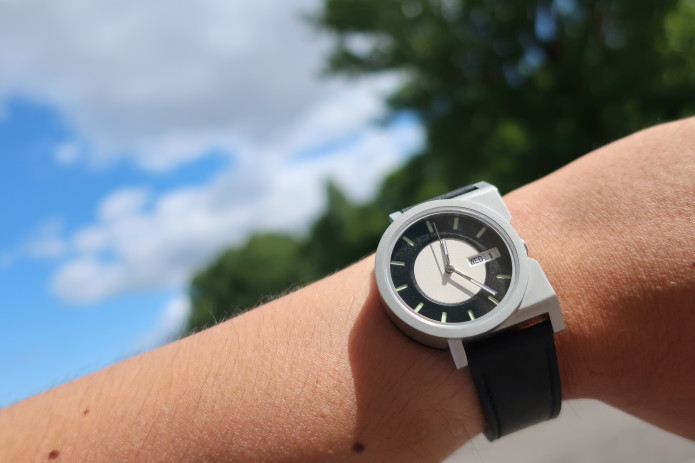
- Small: 37 mm x 42 mm x 11 mm. Perfect for people who have a wrist size of 15 cm to 18.5 cm. Watch body weight 59.6 g (2.1 oz), straps 8.8 g (0.31 oz).
- Ergonomic Design: The crown will never poke the back of your hand.
- Unisex: But maybe not for people with big wrists.
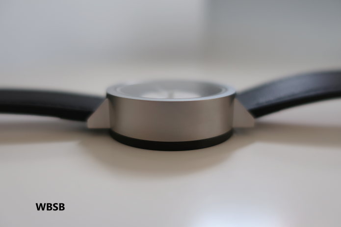
- Unique 2-Piece Case Design: Partially inspired by Étienne-Louis Boullée's architecture Cénotaphe à Newton (1784). Made with 316L Stainless Steel.
- Time & Day-Date (EN/JP): All the necessary information on your wrist. Hands and hourly indexes lumed with SuperLuminova C1.
- Seiko Instruments (SII) NH36A: One of the most trusted robust Japanese automatic movements available.
- Sapphire Crystal: Scratch-resistant sapphire crystal is used for the top crystal to prevent scratches. Case-back crystal is a mineral crystal.
- 5 BAR Water Resistant: Enough to get through daily wetness, sweat, and tears. Just don't scuba-dive with it.
- Limited Editions: Each color variant is limited to 100, each engraved with the serial number, so you can be proud of having a rare watch.
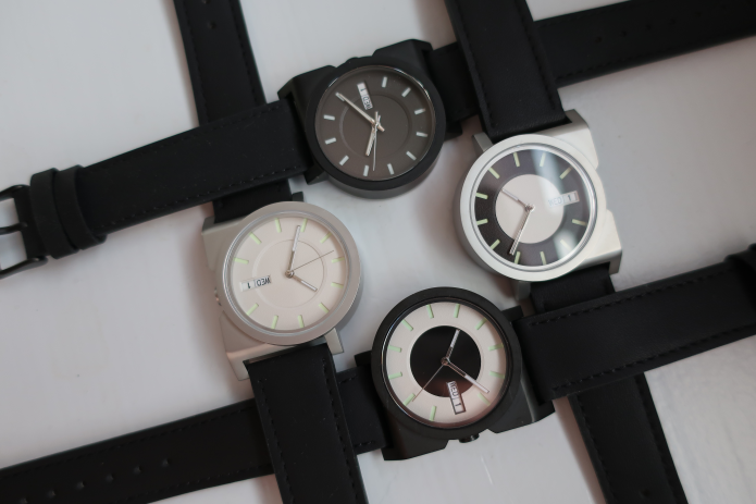
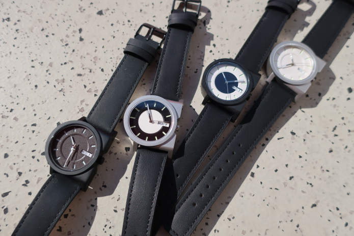
*Please note all photos on this page are prototypes. The production models will have some differences, which are explained below.

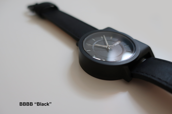
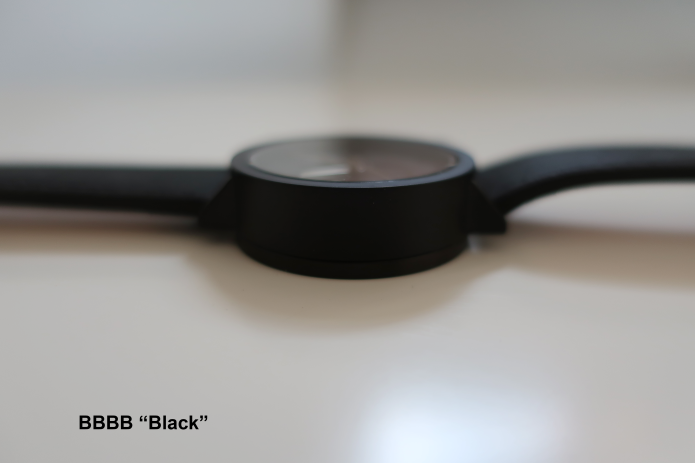
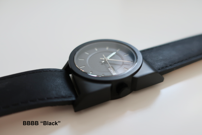
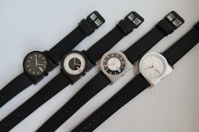
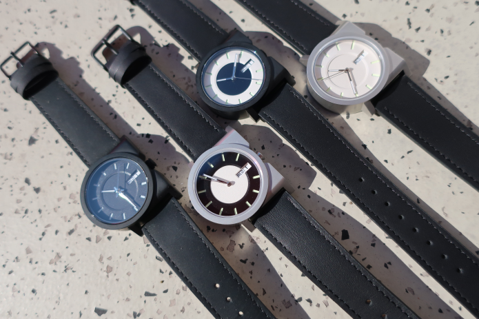
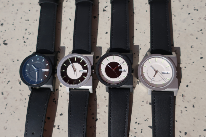
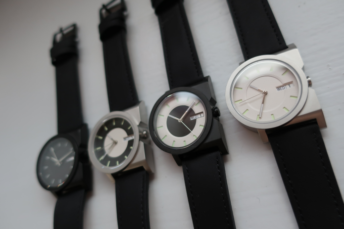
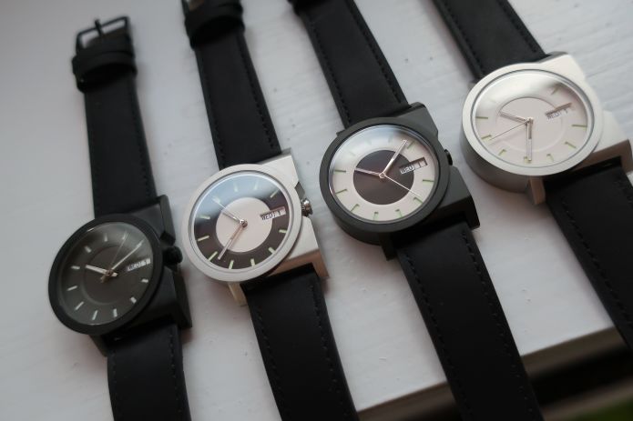
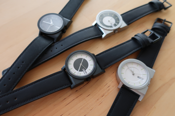
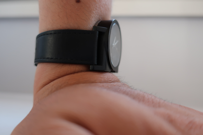
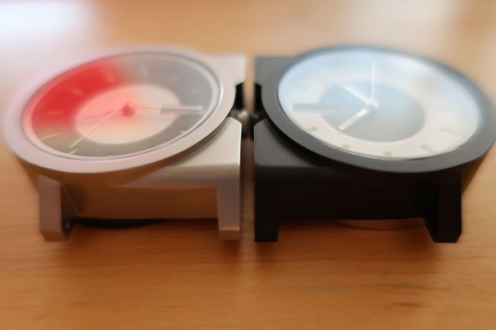
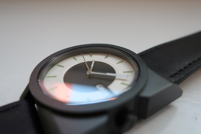
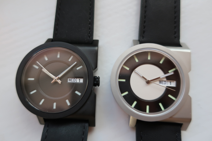
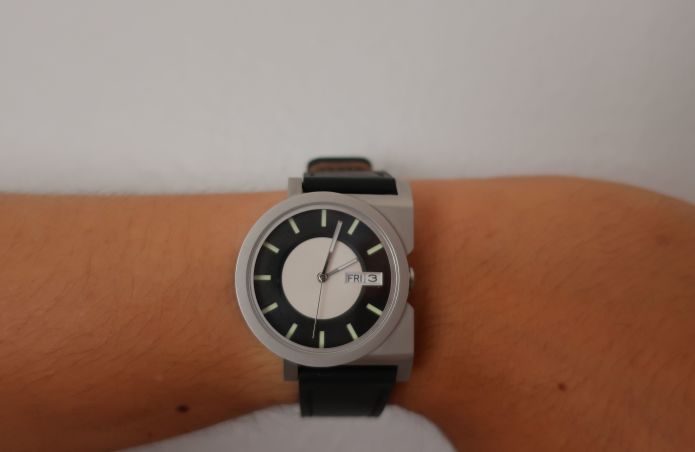
Model BBBB "Black": Dial center - Black, Dial outer - Black, Case top - Black, Case back - Black
Very high readability of time due to the contrast of the dial and hourly indexes.
*Dial, hands, and crown will be changed in the production model. Please refer to other color variants to see how they will look in the production model.
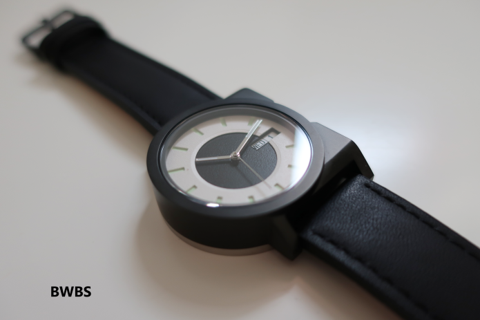
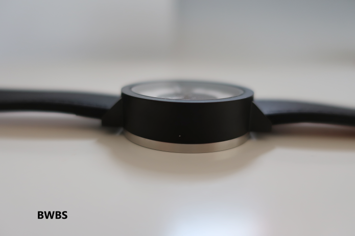
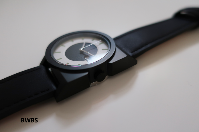
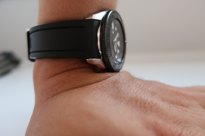
Model BWBS "White Donut": Dial center - Black, Dial outer - White, Case top - Black, Case back - Silver
Because the case is black, and the case back is shiny silver, it has an effect of making the watch thinner than it actually is!
*Lumed indexes will be white (Super Luminova C1) and crown will be changed in the production model.
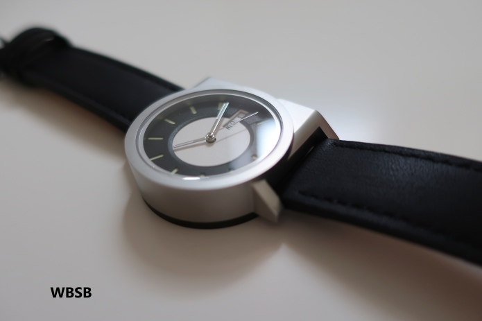
Model WBSB "Black Donut": Dial center - White, Dial outer - Black, Case top - Silver, Case back - Black
Because the case back is black, and the case is shiny silver, it has an effect of making the watch thinner than it actually is!
*Lumed indexes will be white (Super Luminova C1) and crown will be changed in the production model.
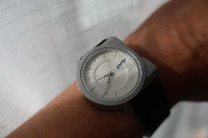
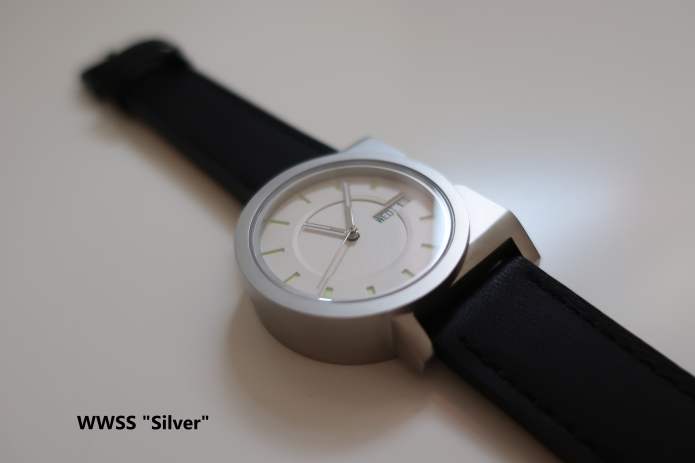
Model WWSS "Silver": Dial center - White, Dial outer - White, Case top - Silver, Case back - Silver
The time-readability might not be as great as with the black dial, but the subtlety of the layered dial—showing the hourly indexes with its shadow—is almost poetic. Also, as the combination of silver case and white dial is fairly common in wristwatches, this watch can pretend that it's not a special watch.
*Lumed indexes will be white (Super Luminova C1) and crown will be changed in the production model.

I was always interested in creating things and designing things. Although I have majored in a design-related field at university (Environmental Design), I've spent just over a decade in writing jobs (You can check my LinkedIn page for the details).
At the same time, I got myself involved in several design-related projects, both in Japan and in Finland (though unfortunately not as a designer). But looking at great designs and how designers shaped their works firsthand, my passion for designing started to burn again.
That was 3 years ago. I made a rough design for this watch (more details on its design process later on Details section), proceeded to build several prototypes, updated the design, and built more prototypes.
Then finally, last year, I launched my own company: AndoAndoAndo, and decided to go into production.
The first collection, "A-1," was designed with the principle of simplicity, ergonomy, and functionality.
- Simplicity: There should be no exaggerated decorations. The shape should be integrated with the function and the ergonomics.
- Ergonomy: The crown should never hit the back of the hand. The watch should be able to tell time, while not covering up one's wrist even for a small wrist.
- Functionality: It has to be entirely functional as a watch. It has to show the time, day and date.

Ok, above was just a short explanation of this campaign and a summary of the watch design. But here comes the real explanations.
If you don't like reading long texts, you don't have to read the below—you can go ahead and back the campaign right now!
If you want to know about the design and the watch's details, before you back the campaign (or after you back the campaign), please go ahead and read through the long explanatory texts and the design sketches. :)

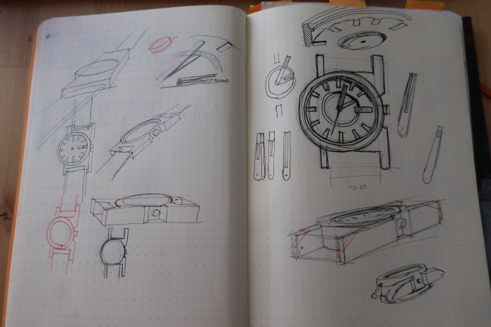
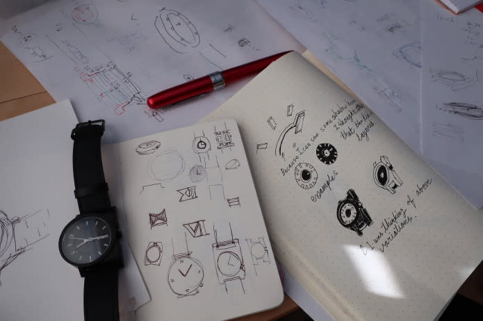
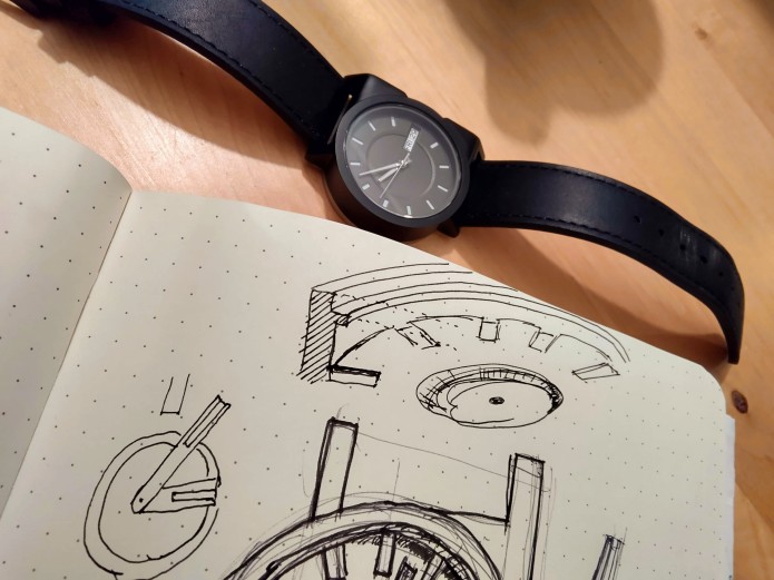
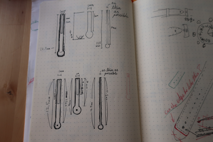
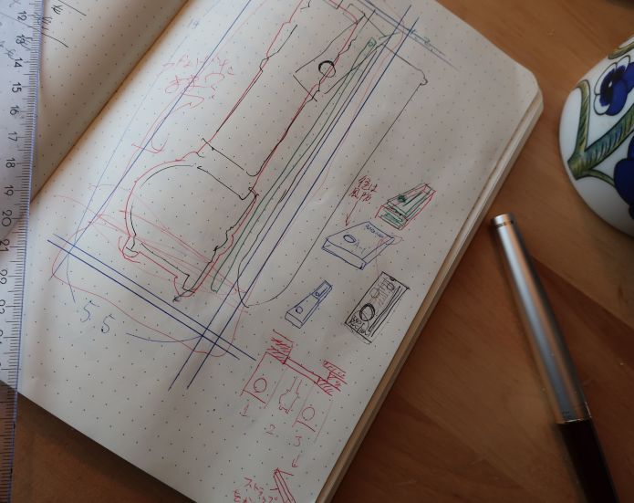
(The design process of the watch case is messily shown in this picture. Isn't it refreshing to see actual design sketches rather than rendering-based, fake sketches on a campaign page?)
It started from a simple round and a rectangular shape combined—from the left page's left top, to the final design on the right bottom.
A watch movement is circular, and watch hands rotate. Plus, I wanted this watch to be small, so naturally, the dial should be round. But the placement of that round "core" part of the watch doesn't necessarily have to be in the center of the watch.
Where should it be then? I designed the placement of the watch core on the left. But why left? Is this placement important? Why can't the watch core be in the center, like most of other watches?
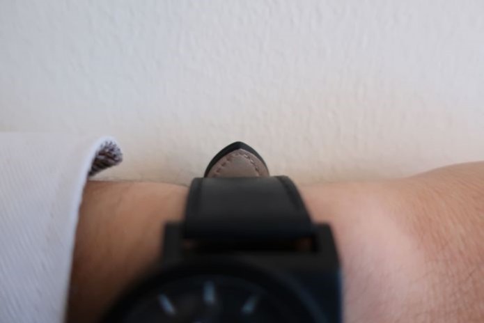
(A-1 Automatic's crown barely touches the back of wrist)
It's because, this way, the watch will not prevent the wearer's wrist movement (if the watch is worn on the left wrist), and so neither the watch case nor its crown will not hit the back of the hand. To make sure the crown doesn't hit the back of the hand, the crown is placed on the dimple of the case.
I make things a lot using my hands, I draw, sculpt, and design, while wearing a watch. Most of the watches I have used had one problem in common. The crown of the watch hits the back of my hand.
This problem can be easily solved, by moving the watch core to the left side. But most of the watches available on the market today aren't designed that way, possibly so both left-handed and right-handed people can wear them.
To me this seem like a flaw of the traditional wrist-watch design (in which the case is wider than the strap width, and the crown is bumping out from one side of the case).
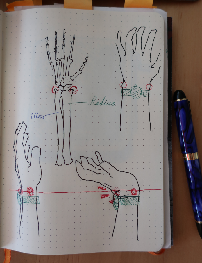
If you are like me, wearing a watch not too loosely, and below your "styloid processes of Radius and Ulna" (the pointy part of the lower arm bones at your wrist), then the straps prevents the watch from sliding on to the wrist at these bones, while the watch is prevented from going the other way as this part is the thinnest part of the forearm. (I understand there are other ways of wearing a watch, but I believe this is the most common way of wearing a watch.)
(Other brand's watch, with its crown buried into back of hand)
But while the strap stops at the bumpy part of the bones, the watch case and the crown will go over these bumpy bones. Another thing that goes over these bumps is the back end of your wrist. Yes, the wrist can bend more than 90 degrees backwards when pressed against a wall or desk—in my case, 105 degrees. This creates a chunk of skin and muscle on the back of the wrist tacked onto the bottom part of the hand.
So logically, a traditionally designed watch worn at this position will collide with the bottom part of the back of the hand.
(A watch with two crowns: one at 3 o'clock, one at 4.5 o'clock; both crowns are against the back of the hand so intensely, you can't even realize that there is a 3 o'clock crown. I don't want to climb a mountain with this one.)
The same design flaw exists in watches with the crown placed at 4 o'clock position. If the designer claims that the 4 o'clock placement was intended to prevent the crown from poking the back of the hand, you should doubt it. Because that part of the back of the hand is highest when bent backwards.
Besides, the placement of the crown at the right side of the watch (considering that the watch is designed to be worn on your left wrist) doesn't really make sense.
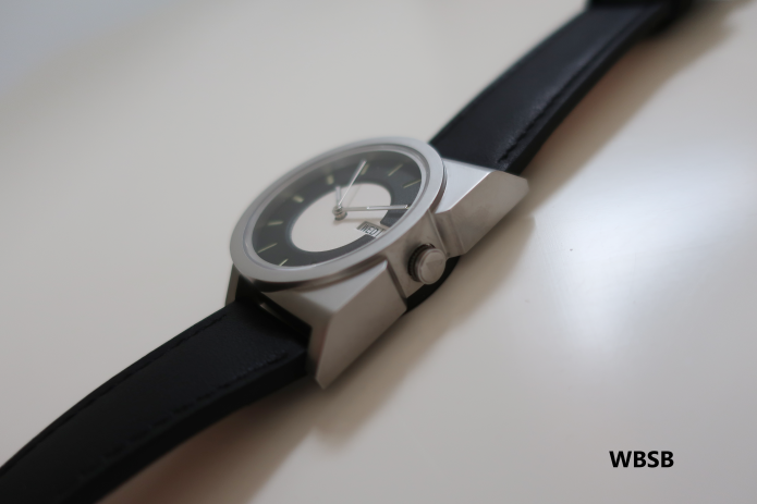
Why? Because you shouldn't pull the crown while you wear a watch on your wrist. This is because you might pull the crown at an angle and break the stem. Also, with the accuracy of modern wrist watches, you don't need to correct the time everyday.
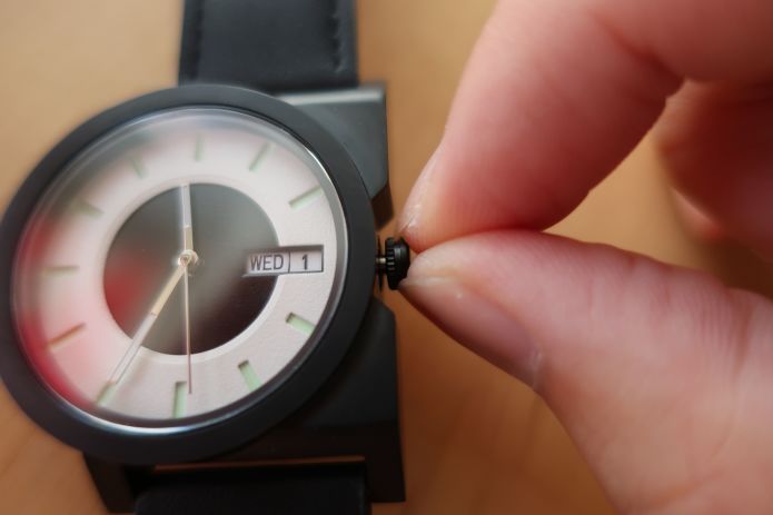
This is a simple push-pull crown. With this design, a screw-in crown is overkill, as it only has 5 ATM water resistance, and the crown is already difficult to pull out accidentally.
You can simply pull the crown after removing the watch from your wrist (and appreciate the movement and the case back while doing so), holding the crown from the top of the watch with your index finger and from the bottom with your thumb, and then safely pull the crown and change the time/date/day.
You don't expect a professional diver to pull the screw-down crown while diving, right? Then why do most of the diver watches place the crown onto a place where it might hurt the divers during their missions? Do they have such a horrible movement inside that they have to adjust it every hour? Maybe the mysteries of the sea dwellers are deeper than I can imagine.
(MAS Watches' The Irukandji solved the crown problem by providing four different placements for the crowns. At the same time, this allows both right-handed and left-handed people to enjoy the watch crown-poking free.)
Oh, and the case is sandblasted so a small scratch won't be the focus of attention (which it often is if a watch case had polished finish).
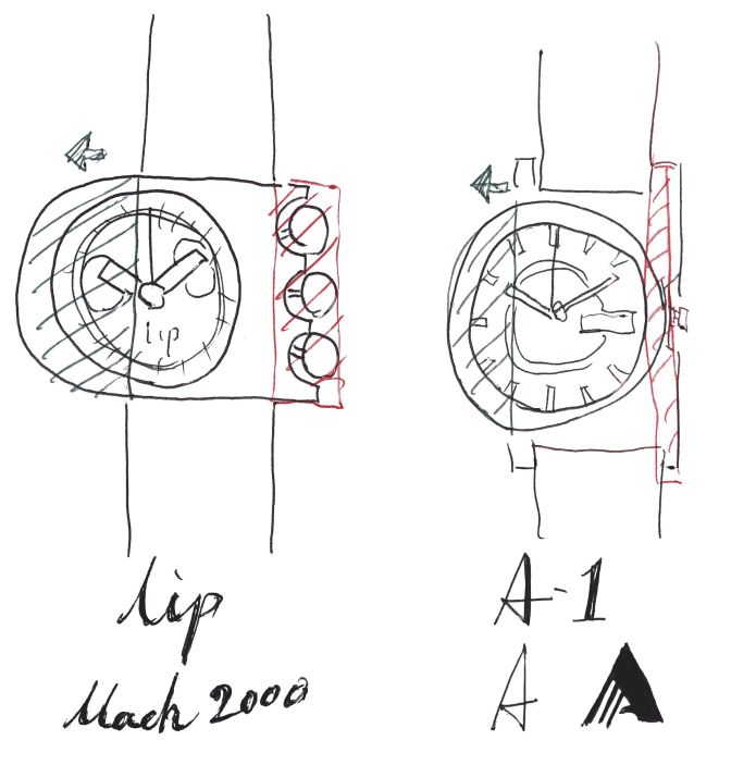
I sometimes get to be asked, "Were you inspired by LIP Mach 2000 by Roger Tallon?" (Or Seiko "Ripley" or "Bishop" by Giorgetto Giugiaro)
Indeed I knew the existence and the look of Mach 2000, so I cannot completely disregard the idea of my design's being inspired by it unconsciously. But, there is a big difference underneath the design process and in why both watches are off-centered.
I would assume that the Mach 2000's off-center dial design is more to do with having these big eye-catching pushers. And the dial being left-sided is due to the exaggerated pushers restricting user's wrist movement restricted. So the off-centered dial is the result of a design choice of the pushers. (There are some LIP Mach 2000 models with centered dial and rectangular case with only one “ball,” which has a shorter crown stem and therefore the dial didn't have to move off the center.)
My watch design is off-centered is solely because I wanted the wearer's wrist movement not to be interfered with the watch case and its crown. The left side of the case is round, because at first I wanted to make the case as small as possible; and the right side of the case is more square, because there was a need to attach the straps.

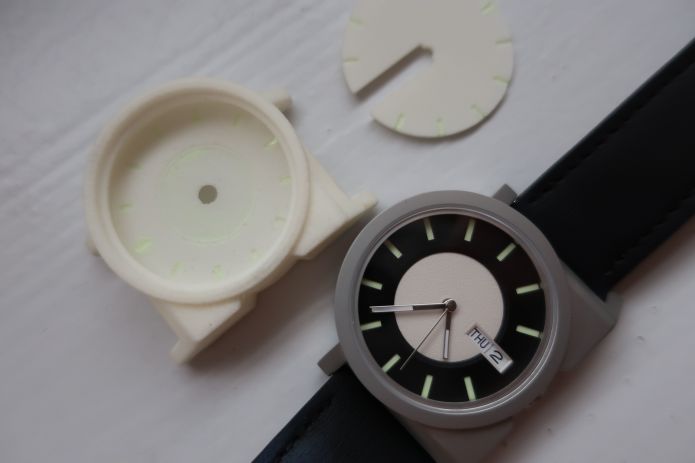
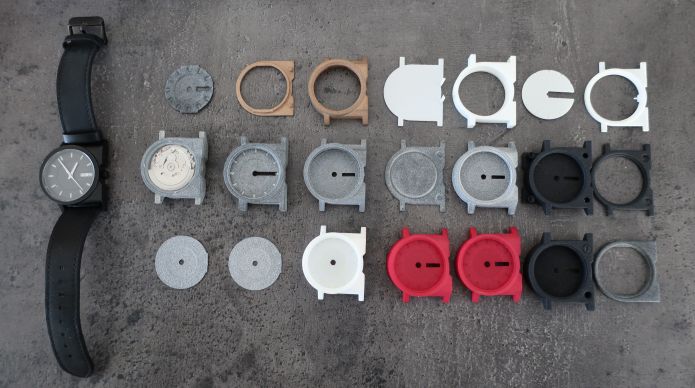
The original reason behind the lowered rounded center of the dial is because I wanted the hour-indicating indexes to be placed inside of a cut-out. This was because I originally planned to make this watch by 3D printing, and hand paint or rather pour the lume (Stuart Semple's LIT) onto the index-cut-out.
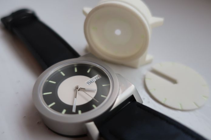
But if I just raise the dial to make enough space to pour the lume, at least on the very first 3D-printed prototypes, the hour hand touches the dial (mostly due to the minimum printable thickness restriction of the 3D printing service). So I lowered the center to make enough space for the hour hand to be able to move.
The lowered rounded center has the same radius as the hour hand, and its round shape resonates with the "bezel" part of the case, as well as the inner edge of the bezel, which supports the sapphire crystal.
There is also a subtle element you can see in the dial (A bit too subtle probably no one would notice nor care though).
Usually below the crystal you will see the inside of the watch case, going directly below from the edge, or there might be a chapter ring making the dial surface smaller than the actual dial radius. But in this design the inner edge of the bezel supporting the crystal is overhung.
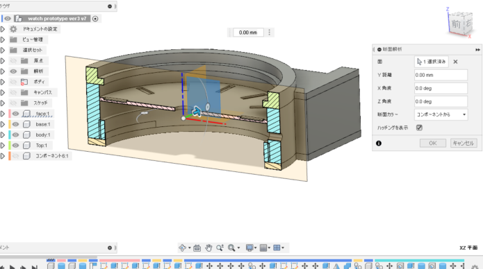
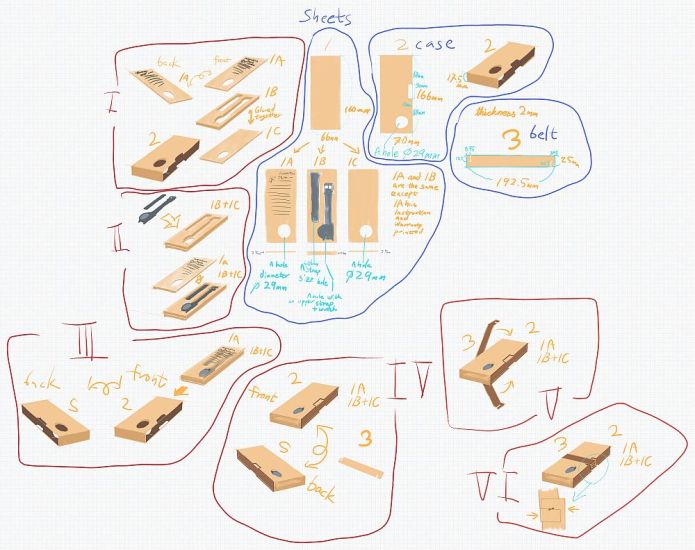
(Above image: I designed this watch with Fusion 360)
Meaning there is a 0.5 mm setback, which provides more space for the dial surface, 1 mm in total, compared to a traditional watch with the same crystal diameter. So the indices have more visibility, more sunlight can hit the lumed indexes, and the shadow from the overhang adds the additional depth in this seemingly simple small dial.
This also means that you cannot see the surface of the dial in full from any angle, unless opening up the watch and taking the dial out.
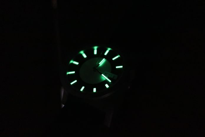
And of course this watch's dial and hands glow in the dark.
Most of the photographs in this page are prototypes with SuperLuminova C3, but the production model would use SuperLuminova C1, which would look whiter when under the light, and slightly brighter when glowing.
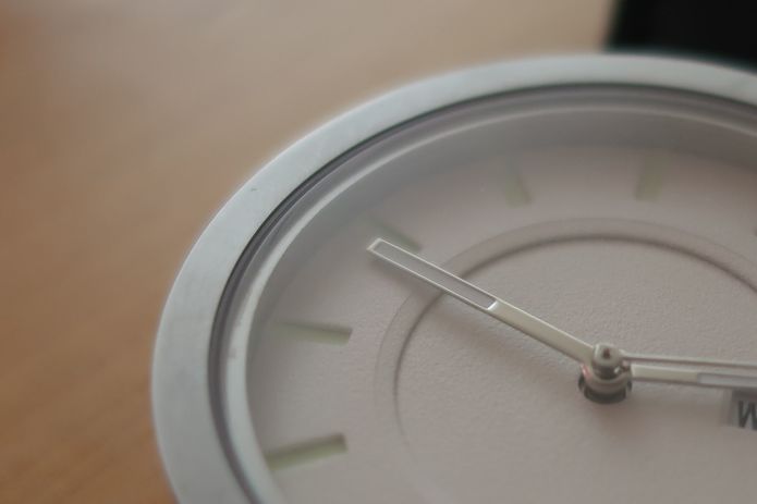
Rough dial surface makes the time easy to read, contrasting with the polished hands.
I understand that some would prefer to have minute markers on the dial. But I believe adding each minute mark on this design was not necessary for this particular watch.
To know the exact time might be important in some situations. But then you would probably have a quartz watch or an automatic watch with much higher precision. Considering that, and that the hour indexes can indicate the passage of time every 5 minutes, I decided that minute markers were not necessary for this watch. Also it wouldn't be impossible to guess the right minute without the markers, by dividing the space between hourly indexes by 5.
I would also like to mention that my grandfather was a very strict person, and he was never late for a meeting. He always told me to arrive at the location 5 minutes prior to your meeting. ;)

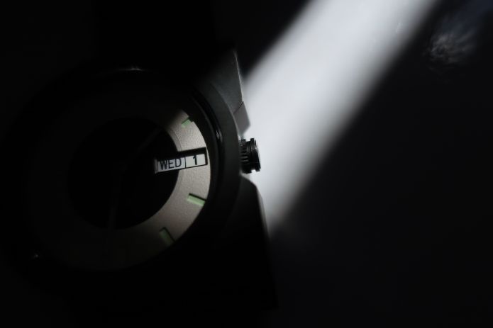
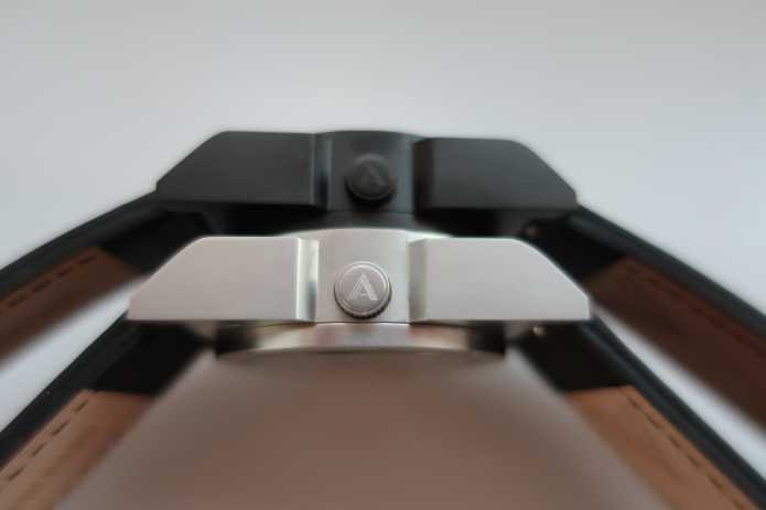
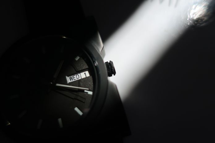 If you look at the watch from the top, you can see that the rightmost part of the crown is at almost the same level as the case's rightmost edge. This way, the crown would not hurt the back of the hand, and it also it prevents the crown from being pulled out by mistake.
Earlier functional prototype (above picture) had a crown with two sections separated by a gutter. Both sections had the gear-edge. The gutter is there so one could pull out the crown by pinching the gutter part with fingernails.
The second functional prototype had a similar construction, but the outer section had no texture, while the inner section had the gear-edge. I thought that this way there was much less chance for things to be stuck on the crown, as the outermost section has no place for things (lints, etc) to stick on.
I was right. A bit too spot-on right. The outer section was so smooth, there would be no lint sticking, but it was also too difficult for my fingertips to rotate the crown.
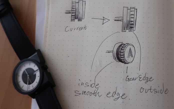
The final production would have the outer section gear-edged, and the inner section smoothed, like in the above sketch.
The crown also has the AndoAndoAndo logo engraved on the crown top.
If there are enough people—more than 200 to be specific—who would like to have A-1 Automatic for wearing on the right hand, I would produce it.

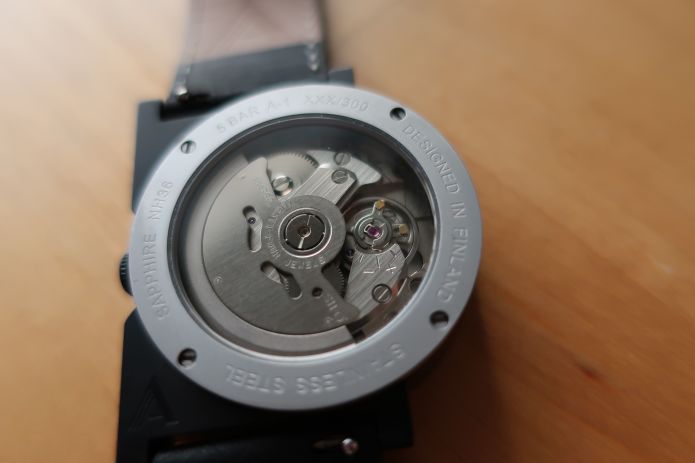
(The case back engraving will change in the production model)
I understand that some watch enthusiasts would prefer the case back covered, especially on a generic movement with no decoration, and I didn't even put an original rotor. But I designed this as the exhibition back with the mineral crystal, for two reasons.
- Some might refer to the simplicity of this watch as characteristic of Nordic / Scandinavian design, Deutscher Werkbund, Bauhaus. These styles and movements have similarities in their simplicity born of the function and beauty emerging from the functionality.
NH36 (and its brother NH35) also bear these elements. It is not the lack of decoration nor the lack of an overly complicated mechanism, but the form created purely from its functions—from the pursuit of the efficiency. Also, the fact that NH35/36 is one of the most widely used automatic movements in the world tells much about this movement's superiority and beauty subjectively.
Those who only seek superficial beauty might not realize the true beauty in this movement. But microbrand enthusiasts and design enthusiasts would understand this beauty.
- The NH36/NH35 movement is known for its affordability, sturdiness, trustworthiness, and beauty. No decoration, but otherwise seemingly impeccable design. But as far as I know, there is one weakness: its Magic Lever system. Seiko developed the Magic Lever so the movement can wind when the rotor moves in either direction. It's a clever system, using fewer parts compared to the Swiss competitors while keeping the cost of the movement low.
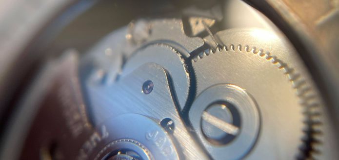
(Image of another brand's watch, showing the NH35A's chipped transmission wheel)
The weakness is that the small teeth of the transmission wheel (which is a wheel pushed by the Magic Lever) tend to chip. While a few missing teeth don't cause any malfunction, when many teeth are chipped, it affects the winding efficiency.
By having the clear exhibition back, you can easily check the condition of the transmission wheel without opening the case back.
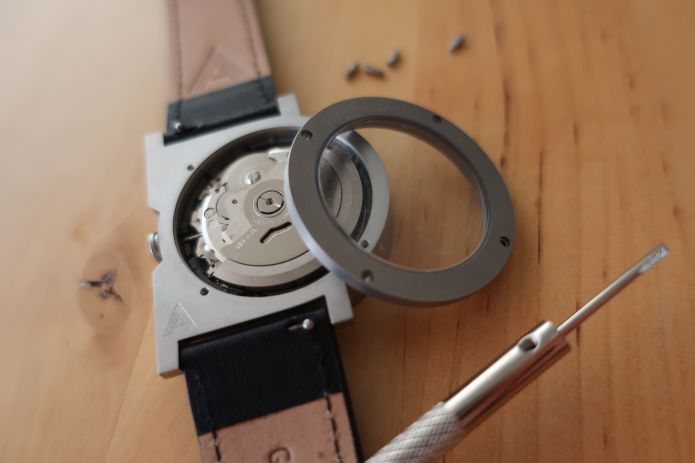
If you ever have to fix the movement, it will be much easier if the watch movement has no unique parts, such as an original engraved rotor. You can just pop out the movement by using a precision driver, remove the stem and hands, then put a new movement back in.
The reasons for this crystal being mineral is that a case back faces less opportunity to be scratched, unlike the top crystal. And also a mineral crystal is more affordable compare to the scratch-resistant sapphire crystal, which is used on the A-1's top for protection.
As for the reasons why this watch uses a mechanical movement, instead of a quartz one, are:
- That nice feeling that your movement is powering your watch
- If you have many watches to wear, you don't have to change the battery
- You don't have to change the battery every few years
- There is no battery leak even if you forget about the existence of the watch and kept it in a drawer for a decade
- It's fun to look at the exhibition back to see tiny parts moving
- The comforting ticking sound when placing your hand near your ear
- The sweeping second hand is nice to look at
So the reasons are more or less emotional-oriented rather than functionality.
However, if there are enough people who would like to have this watch with a quartz movement, I would consider designing a quartz model (which would be designed anew, and surely thinner than the A-1 Automatic).

I believe hands are one of the most difficult parts of the watch design. If you pursue visibility, you might want to make it big so it would stand out in the dial, but at the same time big hands would obscure the dial too much.
Also, the length of both hands is an important consideration when thinking about the readability of the time.
I designed these hands to be straight hands with no decoration, and polished, so they would reflect light—and there is a contrast between the grainy dials diffusing the lights.
(The first functional prototype having counter-balance on hands on left / The second prototype with no counter-balance on right)
The production model will have no counter-balance. Often watch hands have a counter-balance part coming out from the opposite end. Although in some hand-design a counter-balance is necessary but at the same time it could be a distracting element when checking the time.
Adding the visibility to the hour and minute hands are SuperLuminova C1.
The needle-thin second-hand is visibly different from both hour—and minute—hands, so it would be easy to check the time even at a very brief glance of the dial.

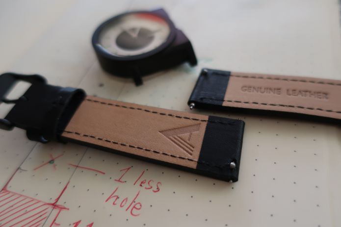
The length of the strap is a very common one—the part with the buckle is 75 mm from one end of leather to the other end of leather, and the other half is 114 mm.
Although the strap is in a common size, it would fit well on a small sized wrist compared to a "men's" wrist watch with an average case size, such as around 40 mm (and lug-to-lug is 45 mm). This is because the case size (from left to right) is 35 mm, and the lug-to-lug (a lug is the part where a strap is attached) is 42 mm.
Also, a common strap has 8 strap holes, but this one has 9 holes. An extra sizing flexibility!
Theoretically, a combination of this watch and its strap would allow a wrist measurement of 15.5 cm (6.1 inch) to 21.3 cm (8.38 inch). But probably the most comfortable measurement are 14.5 cm (5.7 inch) to 19.8 cm (7.79 inch).
Here are some examples:
- My wrist measurement if 16.5 cm (6.49 inch) and the third smallest strap hole fits well.
- My wife has a wrist measurement of 15 cm (5.9 inch), and the smallest strap hole is slightly tight, and the second smallest strap hole is comfortably fitting.
(If you have wrist measurements greater than 19.8 cm / 7.79 inch, you can purchase an extra-long strap separately on shops such as Hirsch Straps)
The lugs of the watch are 20 mm, a very common width. This means when you want to buy a new strap for this watch, you should chose the one that says "20 mm".
The strap that come with the watch have a quick-release system. So there is no need to use any tool when removing or attaching the watch strap.
This is one of the reasons I didn't produce any variant for the strap. If you are someone who would back a campaign like this, an unknown microbrand's crowdfunding campaign, there is a high probability that you already have several watches, and therefore several straps.
So if you have your favorite pair of 20 mm straps, you can easily swap them. And if you haven't tried strap-swapping, believe me, it is fun—it gives a new look to the watch you know! If you don't have any other strap, companies like VARIO offer good selection of quality straps at affordable prices.
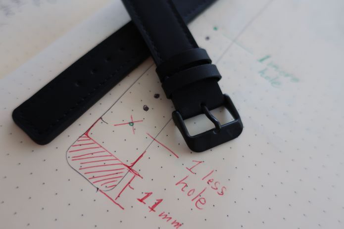
One of the things I disliked about the traditional triangular shape of the strap-end is that the end part peeks at me (almost like a conehead hiding behind my wrist).
I don't understand the reason the strap-end usually look like this.
Because, if both straps are fixed to the lugs of the watch when placing the straps around your wrist, straps align naturally. While this pointy end design implies that it must be so difficult to put this part into the strap belt, it isn't.
(This image is of a prototype strap; the product version will have an 11 mm shorter strap end, so you wouldn't see a squarehead like this if you wore it with the 4th-smallest strap hole.)
So I designed the strap-end slightly shorter, and flat.

The package of the watch is also as simple as the watch itself. I understand that a fun or luxurious unboxing experience could make a product more satisfying. But at the same time, an oversized box or overpacking is just a waste of materials, as well as it requiring more energy to manufacture, more fuel to deliver, and more space to store at your home.
So the package I designed is minimalistic and environmentally friendly.
Some might think it is risky to have a hole on the front, but considering that the scratch-resistant sapphire crystal is covered with a protective plastic sheet, I feel confident that the package would protect the watch during the shipment.
Follow AndoAndoAndo's social media accounts and follow our journey, as well as to get to know about our future projects!
Instagram: @andoandoando_design
Facebook: AndoAndoAndo
Website: AndoAndoAndo.com
Media kit: AAA A-1 Media Kit Images, Early Prototypes, Illustrations